Our weekly Portfolio Spotlight series is a close-up look at the talented people using Format websites to showcase their work. This week, we interview graphic designer Melissa Ya.
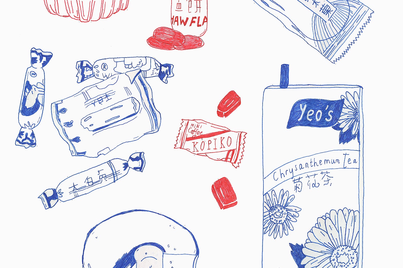
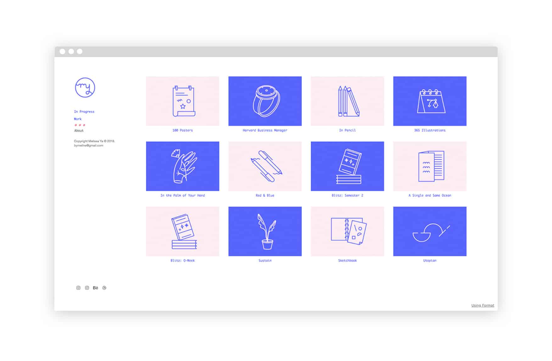
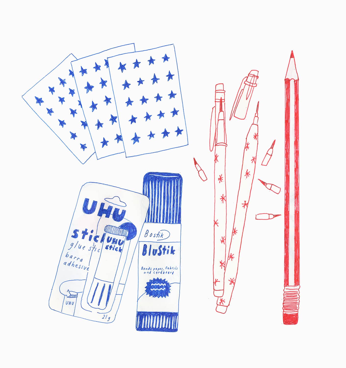
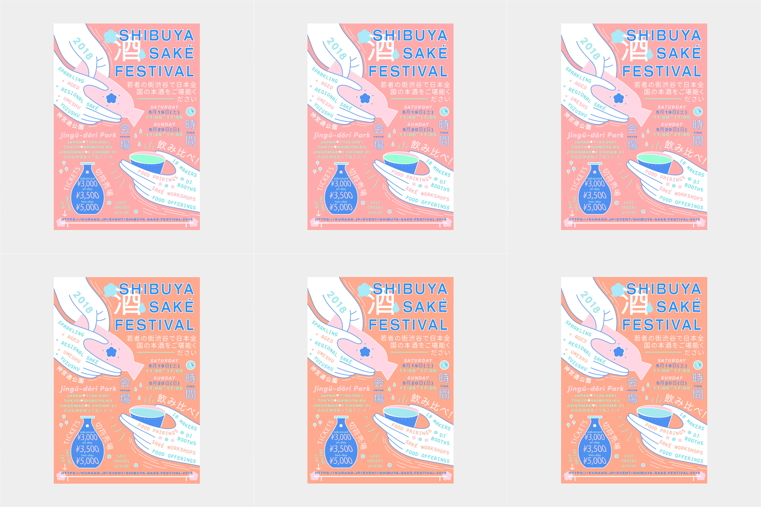
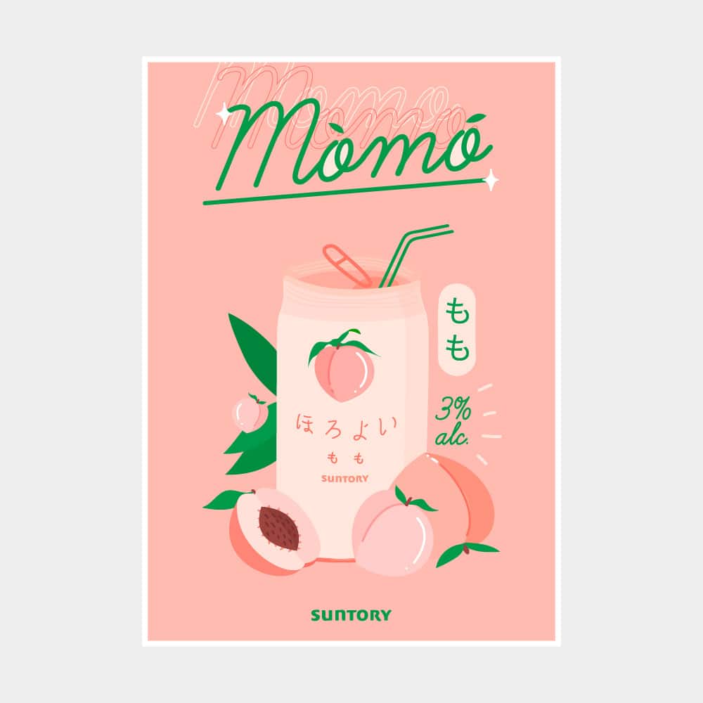
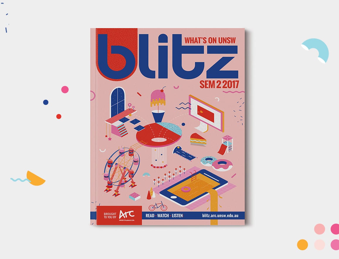
Based in Sydney, Australia, designer Melissa Ya combines punchy, colorful graphic design work with more personal-feeling sketches that explore objects from her own life. On her website, Ya uses a color scheme that’s perfectly in line with her work to create a cohesive feeling. Pale blue and pink fonts echo colors often found in her projects, and a unique logo made of her initials adds personality to her menu.
Ya created custom icons for her homepage, allowing her to showcase an assortment of past commissions and ongoing personal projects with matching imagery. Displaying works this way makes it easy to navigate through Ya’s portfolio and lends a professional, polished touch to her website.
We got in touch with Ya to learn more about her creative practice. She shared how she first got interested in art and design, as well as some useful tips for what to do when you’re feeling uninspired.
[www.melissa-ya.com](https://www.melissa-ya.com)
How did you first get into design and illustration?
I’ve always enjoyed the process of curating a whole bunch of things in a way so that it looks nice together. Things like pairing fonts and creating layouts for Bebo and MySpace profiles on MS Paint when I was young. My formal “introduction” to design was through an elective I took in high school. I learned that there were multiple ways to express an idea visually without compromising on both the aesthetics and function. Before then, I thought things had to look pretty and without meaning.
I only started becoming serious about illustration about two years ago through experimentation. I was never good at drawing, or did much of it, while growing up, so it’s actually surprising to see how illustration plays an integral role in my current design practice.
Do you consider yourself to be more of a designer or an illustrator, or both? How do you see the two disciplines being the same or different?
To me, Grafikdesign and illustration are two separate creative fields with some overlap. I’d call myself a designer who heavily relies on illustration to visually communicate (or support) an idea, but am also able to use other forms of visual elements to do that.
I think that’s where the distinction lies. I’d expect a graphic designer to understand the basic principles of drawing and be able to roughly sketch out their ideas, but I wouldn’t turn to an illustrator for advice on typography, layout, etc.
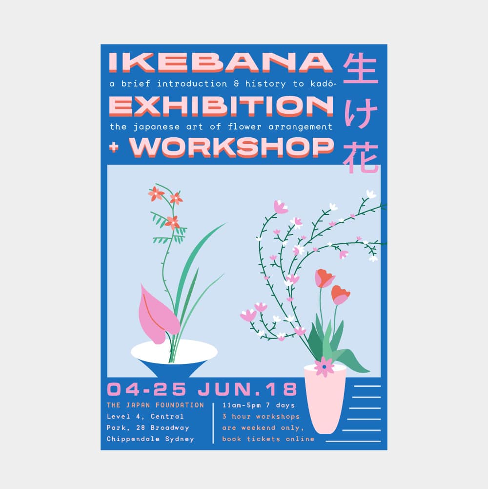
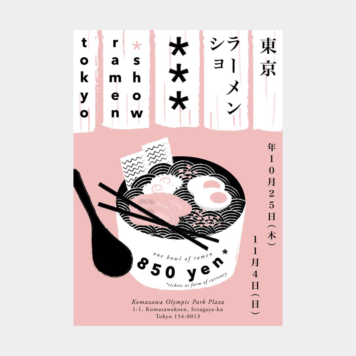
On your website you share some long-term personal projects. What inspired you to start projects like these? Do you have any advice for creators looking to start a personal work like this but feeling daunted by the prospect of creating 100 posters, for example?
When I began my 365-day project two years ago, I remember being stuck in a creative rut and unhappy with my overall lack of technical skills. Illustration was pretty new to me at that time, so it was a good way to creatively challenge myself while unlocking the magical powers of Adobe.
It’s really important for me to work on personal projects because I can go as wild as I want and push myself creatively. Start with smaller projects if you’re intimidated by the length of it, then slowly build on that. Don’t beat yourself up if you miss a prompt past the deadline—there will be times when you feel like you’re burnt out creatively, and that’s perfectly okay. When you’re not, throw yourself in it completely, and remember to enjoy the process, because it is absolutely rewarding. Hopefully by the end you’ll have made a bunch of super cool stuff that you never imagined you could!
Wie nutzt du deine Website, um deine kreative Arbeit zu unterstützen?
It serves as a portfolio and an archive of my work. How my work is presented across digital screens and platforms is important because that’s what everybody is staring at these days.
Woran arbeitest du im Moment?
A whole buncha things are works in progress: the ongoing 100 poster series, an animation for a lyric visual, custom icons for a start-up company.
Name two designers or artists we should be following.
Tadashi Ueda und Jaemin Lee. They make me weep and wish I’d made every piece of work that they’ve created.
Du denkst, dein Format-Portfolio sollte in unserer Portfolio Spotlight-Serie vorgestellt werden? Sende uns einen Link, um berücksichtigt zu werden.
