Each year brings with it new web design trends, and in our very online times it seems that trends move faster than ever before. While certain classic elements will always be in style, there is so much to get distracted by on the internet that you need to stay fresh and up to date if you want your web design portfolio to grab and hold people’s attention.
Nach Angaben von one study of 10,000 people from ad-tech company DoubleVerify, our online content consumption has doubled in 2020. This incredible jump in our time spent online means that high quality web design is more important than ever, since it can make for a much more enjoyable online experience. It can also help set your website apart in a sea of competitors.
If you’re ready to give your website a refresh (or build a new one) for 2021, check out these trends and consider which ones might help take your website to the next level. While trends aren’t meant to be blindly followed, picking and choosing the elements that speak to you and to your target consumer is a great way to grow your business and get more eyes on your website.
Web Design Trend #1: Dark Mode
With all those screen time hours racking up between our computers, phones, and TVs, our eyes are more strained than ever. This was one of the UX design trends 2020 brought us, with Instagram introducing a dark mode and Apple and Android offering dark themes for their devices. It provides a less tiring user experience, something very important if you want people to stay on your site or app for a long time.
In 2021, expect to see dark mode expand into web design for all kinds of businesses and organizations. Not only is it soothing to the eye, but it also lets you draw attention to certain parts of the page by highlighting them with white or color. A dark mode-inspired web design is modern, cool, and sure to make your site stand out.
Web Design Trend #2: A New Take on Gradients
While gradients have been popular among designers for a few years now, don’t expect them to go anywhere in 2021. This trend is holding strong, and in the year ahead expect to see gradient backgrounds and site elements updated with a 3D effect to make them jump off the page.
The flatter gradients of the past few years still look fresh, but if you’re looking for some brand new website design trends for 2020 consider making those gradients pop with more shading and dimension. This can be done to site graphics, logos, or anywhere you want a pop of color.
Web Design Trend #3: Depth and Dimension
Jumping off the 3D gradient trend, depth and dimension in website design is something you will see more of in 2021. This can be achieved with the use of drop shadows and a two-tone design. Flat icons and design elements can be updated to what is sometimes called flat design 2.0, where a bit of depth and dimension is added while still maintaining the clear simplicity that flat design offers.
Web Design Trend #4: Neumorphism
You might recognize the term neumorphism because of the relatable term of skeuomorphism. While the two concepts are closely related, neumorphism has a new focus and it’s focused on the color palette. This concept provides a unique experience for their users and will be trending in the new year as well. Neumorphism means a softer interface, lighter touches, and rids of the flashy designs that we may see. Neumorphism combines skeuomorphism and flat design to create more dimensions.
Web Design Trend #5: Parallax Animation
Another way to add some depth to your user interface is with parallax animation. In 2021, this eye-catching type of web design will be used in creative and memorable ways, since it can be endlessly customized to achieve the desired effect.
When used subtly in transitions and as a scroll effect, parallax draws users in by transforming the screen from a flat, immobile page, to a dynamic and layered landscape. When parallax is used dramatically, making lots of page elements move around the screen, it can be a serious attention-grabbing and immersive tool.
Parallax is a great way to break up grid design. Since a website can still be designed on a grid, the parallax effects make it look more fluid rather than rigid and predictable.
Web Design Trend #6: Interactive Web Design
Since immersing users in an enjoyable experience that they don’t want to leave is one of the top web design goals, we’re going to see a more interactive approach to web design in the year ahead. Look for scroll-triggered animations, which encourage users to explore the site in order to discover the full range of animation effects.
This trend also extends to hover triggered micro interactions and micro animations. These little surprises make for a delightful user experience and are adjusted to suit the specific aesthetics and personality of each brand.
Web Design Trend #7: Different Scrolling Styles
While vertical scrolling has been the standard for as long as websites have been around, horizontal scrolling has become more sophisticated and UX friendly in recent years, making this a web design trend to look out for next year. This is especially popular for mobile devices because you can easily swipe left and right.
Horizontal scrolling is a great navigation choice if your website requires that you feature large images, as an artist’s portfolio might since it allows you to easily fill the page with content that can even spill over across the x-axis. Horizontal and vertical scrolling can be combined in interesting ways to make for websites that are neatly organized and user friendly while feeling interesting and novel to navigate.
Web Design Trend #8: Individualization
The trend for individualization and personalization has been popular across a range of industries for a few years now, and it is impacting web design through the increased use of questionnaires that prompt users to share information that will personalize their experience or product suggestions.
Increasingly, these are used on the home page hero section, where an image may otherwise be used. Engaging users as soon as they land on the page can be an effective way to get them invested in their time on the site, and can also prompt valuable information that can help you improve your product, service, or even website.
Web Design Trend #9: Designed Footers
Footers are getting a makeover in 2021 as well. Traditionally, this section was overlooked in most web designs. It has historically been a purely functional section where the web designer could throw links to pages that are less frequently accessed and a link to a contact page or newsletter.
In the year ahead, we’ll see web designs that make footers a more integral part of the page. These are sometimes called footer boosts or fat footers, and they can include all kinds of information that may be valuable to a visitor.
By including a clear and easy to navigate table of contents for the whole website in the footer, it can also boost conversions by giving consumers an extra opportunity to click to pages that they might have otherwise missed.
Web Design Trend #10: Video Elements
Video is no stranger to any website designer and owner. If a picture is worth a thousand words, how many words is a video worth? Get ready to see way more use of embedded videos on home pages, as web designers tap into the communicative power of videos.
These videos can be anything from a short lifestyle clip of a product being used in the case of a company that manufactures a consumer good to a behind the scenes clip of a photographer at work in the case of a professional photography portfolio, a musician performing on their music portfolio website, or anything else that may be appropriate for a given web design.
Web Design Trend #11: Large Titles
When it comes to headings, more is more in 2021. Web design trends are moving in the direction of embracing large, bold typography. With our attention spans dwindling and the internet offering endless options for mindless scrolling, designers are using large, bold fonts to capture users’ attention and make sure they get the key message right away when they land on a home page.
Web Design Trend #12: Imperfection
Since the eye can tire and get bored with a generic, grid-based web design, imperfection will be one of the major web design trends of 2021. This can be achieved in a variety of different ways, including the parallax effect we looked at earlier. Another way you’ll see this manifest in the year ahead is through hand-drawn elements. This trend can also be seen in Fotografie-Trends with bokeh and blurry images being a style that many photographers have adapted.
These human touches give web designs a more organic, individual feel that is refreshing and appealing when you’re spending so much of the day looking at digitally rendered design elements.
Web Design Trend #13: Product-Inspired Design Elements
As designers look for ways to cater their design work to the needs of each specific client, more are including elements that are inspired by the actual product or service offered on the site. One example could be two sections divided by a line that’s shaped like dripping paint for a nail polish website. This website design trend pulls visitors into the world being created by the web design team.
Web Design Trend #14: Fast Load Times
While the visual experience that visitors have is very important, a critical element of UX in 2021 will continue to be page speed. While this has always been important, especially in recent years, it’s essential to reiterate as websites incorporate more elaborate elements, navigation, and content like video. All of these components can slow down page loading times, so it’s essential that website designers ensure they’re maintaining fast speeds.
In the case of ecommerce, a slow site can be the difference between landing a sale and having the customer leave your business website without buying anything. Visitors aren’t likely to stick around waiting for slow elements to load unless they wirklich want to be there, so this is a key element of good web design in 2021.
Web Design Trend #15: Dynamic Landing Pages
One of the major web design trends of the year ahead will be a move away from static landing pages to more dynamic designs. This can be achieved with a range of elements, including video and micro interactions which are trends in and of themselves for 2021.
Imagine that your visitors have a few pages open, all of a product or service similar to yours. How can you make sure that your page is the one they stay on? Dynamic landing pages, with animated elements, video, and other moving components, can help make sure your site comes out on top.
Website Design Trend #16: Microcopy and Creative UX Writing
While product descriptions have been refreshed in recent years with creative and on-brand copy that speaks in the voice of the brand, in 2021 this will extend to other sections of website copy. You’ll see microcopy, or the very short bits of text you might find on buttons or after you complete an action on a website, carefully written to elevate the experience of visitors.
Every last part of the website, from the white space to the three words of copy that pop up after pressing a button or sending a form, will be carefully considered in the year ahead to make sure that they service the website’s overall goal.
Website Design Trend #17: Abstract Art Elements
One of the major web design trends for 2020 that is spilling into 2021 is the use of abstract art elements in bright, warm color schemes to make a page feel energetic and alive. These are playful and interesting and are used both as static elements or as dynamic moving elements.
These shapes can either be used on their own for a bright pop of color, or they can be incorporated with photography for a custom effect. For designer portfolios, incorporating abstract art elements designed by you is a fun way to showcase your work beyond the actual contents of the portfolio.
Website Design Trend #18: Next Level 3D Elements
Perhaps an example of VR and AR technologies spilling over into web design inspiration, high quality 3D visuals are becoming one of the notable web design trends of 2021. When done right, these can create a truly stunning experience for users, blurring the space between our reality and the reality on screen.
Professionals in industries that frequently work with 3D renderings, such as Architekten, can incorporate them into their web design. However, websites that opt for these graphics-heavy elements need to make sure their sites can handle them with quick loading times, otherwise, they risk losing users.
Web Design Trend #19: Collage
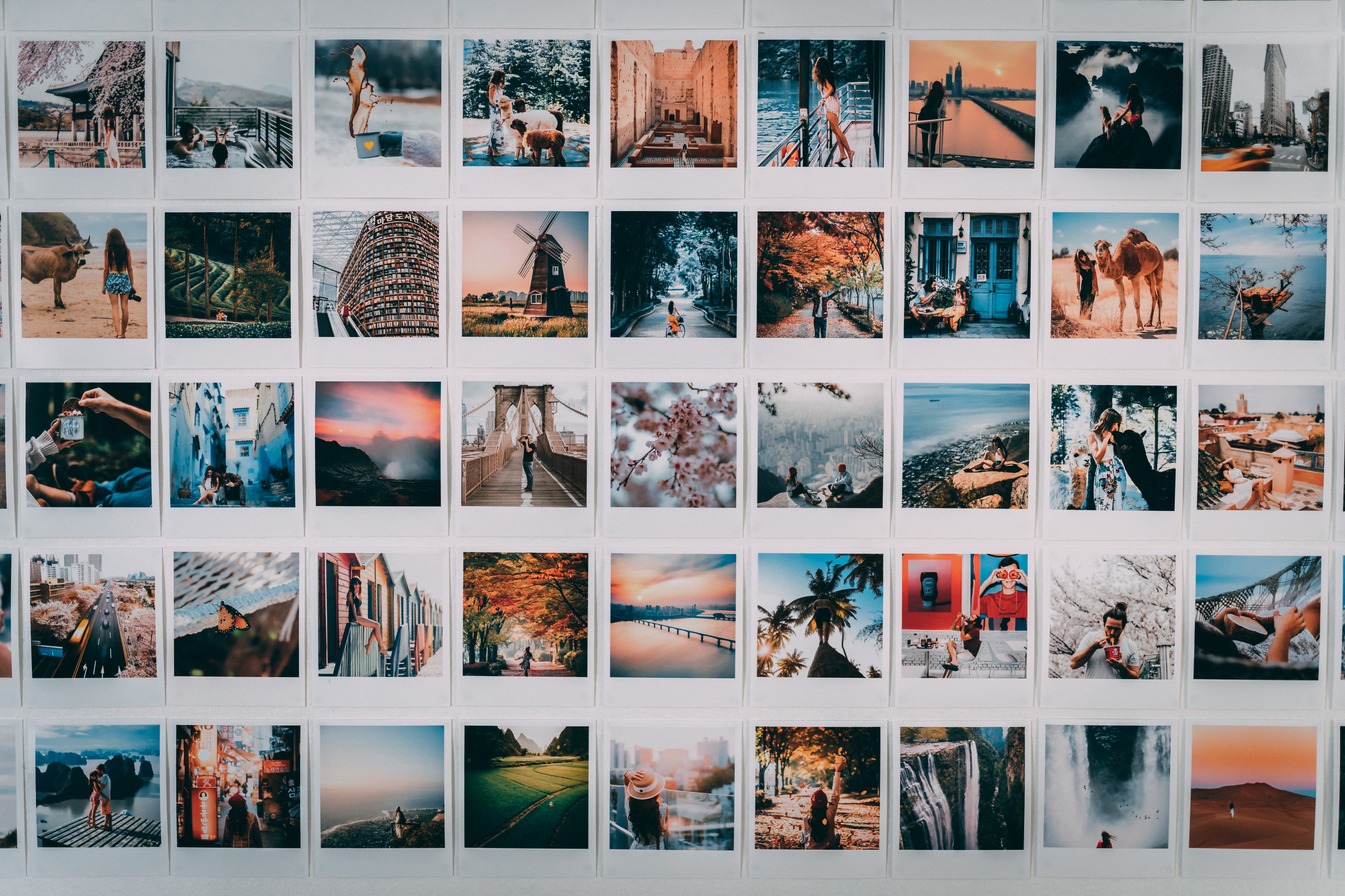
Another rejection of the rigid minimalism and grid approach to websites of years past, collage is shaping up to be one of the must-use web design trends of the year. A perfect choice for Illustratoren-Portfolios, this trend evokes a DIY aesthetic by mixing media and elements in an unexpected way, echoing the collages you made back in grade school.
It’s proof that sometimes the best web design inspiration can be found in our IRL experiences, and can make for seriously delightful websites. It also encourages longer page views, since visitors will want to spend some time taking in all the visual stimulus.
A softer version of this trend is overlapping elements, which can evoke a collage without being quite as dramatic as going all-in on the trend.
Web Design Trend #20: Voice User Interfaces
Chatbots have been in use for a while now, but in 2021 we’ll see UX be enhanced with voice chatbots that help visitors quickly and easily access information. While this is a fledgling trend, the explosion in popularity of smart voice-controlled devices means consumers are getting increasingly comfortable with this technology, and it’s going to become more widely used in web design as well.
With so much more time being spent online these days, good web design is more important than ever. The good news is that even if you don’t know how to write a line of code, there are some great website builders out there that you can use to create the website of your dreams, incorporating many of the trends we looked at here.
Wähle eine Website-Baukasten die eine kostenlose Probe so that you can take the different Vorlagen out for a test drive, and put these trends to use on building your own unforgettable corner of the Internet.
Find more tips for creating a dreamy portfolio website here:
Aktualisiere dein Portfolio: 6 Tipps zum Frühjahrsputz für deine Karriere und dein Portfolio
